P52.2: Who We Become (37)

We are continuing our theme of classic portraiture on Who We Become and this week focusing on the full body portrait.  I decided to be a little silly with mine, since it’s not always easy to take proper portraits of this monkey.  In fact, this portrait probably gives you a better sense of who she is than anything particularly “proper.”  I love that girl. KAC_2014_06_08_0178


Please click HERE to see all the full body portraits at Who We Become.

P52.2: Who We Become (36)

We are continuing our exploration of classical portraiture on Who We Become and this week working on the 3/4 portrait, which shows the subject’s upper body.  It reveals more about the subject’s environment and clothing than the headshot, but is generally less environmental than the full body image.  I didn’t actually go with a particularly classical image this week, but you can tell so much about Avery by her surroundings and I couldn’t resist the fun summer vibe.  Please click HERE to see all the portraits this week over on Who We Become.

KAC_2014_06_07_0100

P52.2: Who We Become (35)

This month on Who We Become we will be covering classic portraiture, starting with a head shot.  Head shots are some of my favorite things to shoot – they are limited in what they show and yet they can convey so much.  Please click HERE to visit Who We Become and see all of this week’s head shots.  KAC_2014_06_01_0301

P52.2: Who We Become (33)

We are continuing our month of color theory on Who We Become and this week we are focusing on achromatic color schemes.  I was at Olympic Sculpture Park earlier today and noticed that the gorgeous views of Elliott Bay were all tones of the same color – the blue of the sky, reflected in the water – and that the beauty of the scene wasn’t about color at all, but instead the light or contrasts of shadow.  This is the color image that I captured, and below it the black and white version I had envisioned and then created later.  Please head over to Who We Become to see all the achromatic color schemes by clicking HERE.

KAC_2014_05_18_0202-2

KAC_2014_05_18_0202

P52.2: Who We Become (32)

We are continuing our month of exploring color theory on Who We Become, and concentrating this week on complementary color schemes.  Complementary colors are those that are found across the color wheel.  My husband brought home this beautiful lilies earlier this week and I’ve been enjoying their gorgeous color for days.  Please click HERE to visit Who We Become, where you can see everyone’s complementary color images and learn more about color theory.  Happy Mother’s Day to all!

KAC_2014_05_11_0083

P52.2: Who We Become (31)

This new month on Who We Become is all about color theory!  (I see myself taking many spring flower images this month!)  For our first week, we have sought to limit ourselves to either a single color or analogous colors – that is, colors next to one another on the color wheel.  Please click HERE to visit all these simple color images on Who We Become and learn a bit more about color theory.

KAC_2014_05_02_0053

P52.2 Who We Become (30)

This week on Who We Become we are exploring creative use of tone.  Split toning is a technique where you can separately add color to the shadows or the highlights.  It was used in the film days to create those old sepia images you may remember.  But today it can be used to add drama and creativity to an image.  In my beach photo below, I’ve added blue to the shadows and a tinge of pink to the highlights.  Although this is done with editing, it more accurately evokes the drama of the sunset scene that I recall in my memory than does the original image.  Please head over to Who We Become and see all the creative use of tone by  clicking HERE.

KAC_2014_04_21_0148

P52.2: Who We Become (29)

This week on Who We Become we are working on mid-key images – images that aren’t full of highlights nor dominated by deep shadows.  My image is of Avery and her best friend James during the golden hour the other evening.  They’d been running around post-Easter egg hunt and the light was soft and gorgeous.  Though there is a bit of brightness from the setting sun, the majority of the image is of warm mid-tones – but all I see are two very happy kids, so glad to be together.  🙂  Please click HERE to see all the mid-key images at Who We Become.

KAC_2014_04_19_5962


P52.2: Who We Become (27)

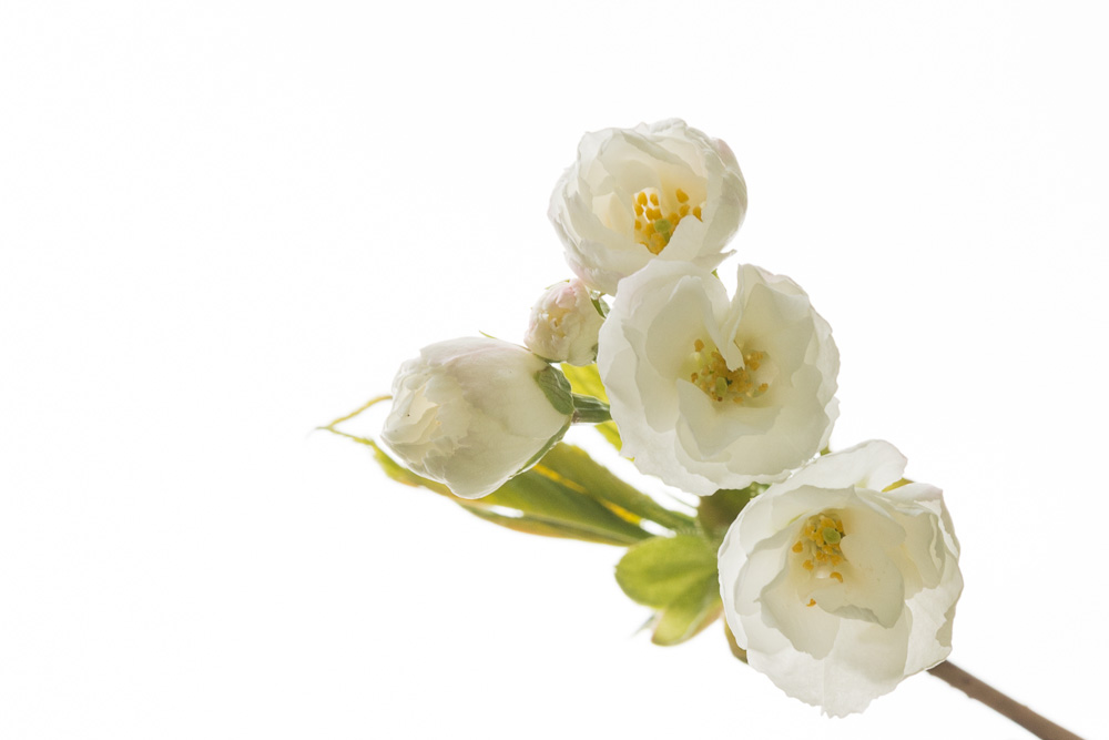
It’s is a new month over at Who We Become and we will be delving into tonality as a means to create or enhance the mood of our images. While not a compositional technique, our goal is to intentionally match the lighting quality in our images with our subject matter. Tonality includes the amount of contrast as well as the qualities of the whites and blacks within an image. For this first week we will be using high key lighting to set the tone for our compositions. This lighting technique is most often used to create very bright, clean images, lacking in shadows and darker tones. Much commercial work has this look, as it is most easily achieved in a studio setting using artificial lighting and a white or similarly light background. Upbeat, modern and distraction-free are hallmarks of a high key image.

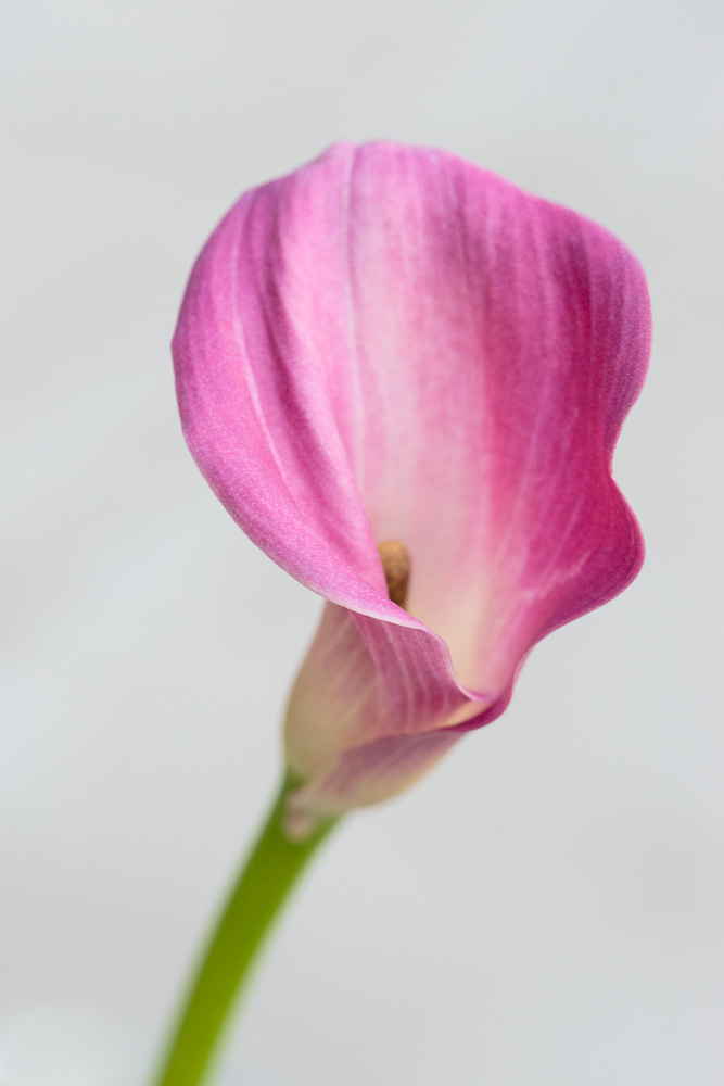
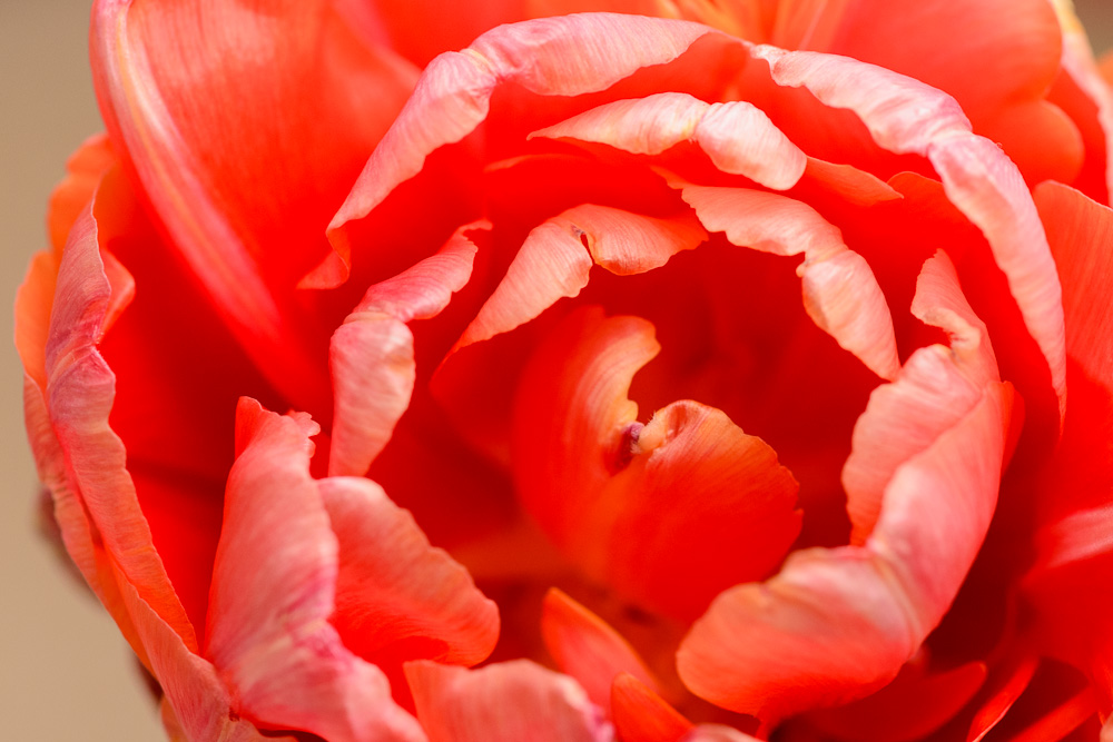
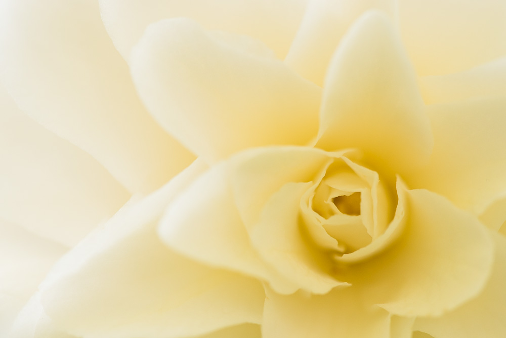
I am very HAPPY that spring is here and decided to take advantage of the gorgeous blooming flowers all around the city.  These were taken at the Japanese Gardens that are part of the University of Washington’s Arboretum.  It’s beautiful there and I highly recommend a visit if you are in town.

KAC_2014_04_04_0010

KAC_2014_04_04_0052

Please click HERE to visit Who We Become and see the mosaic of high key images.